Monday, December 26, 2011

RestoReview: Sushimoto


Sushimoto (UrbanSpoon)

2221 Holdom Avenue, Burnaby, BC
(near Holdom Station on SkyTrain Millenium Line)


Sushi Moto is quite a drive away for me from Richmond, but I was definitely more than satisfied with the food and would have no issue with driving that distance again for the amazing food that they serve.


The friends I dined with tried a wide variety of dishes though we were a little bit disappointed because the restaurant had to turn down some of our orders as they were out of stock on oyster motoyaki, hamachi sashimi, and uni sashimi. :(


Verdict
Highly recommend
For anyone who loves to try unique Japanese flavors. It's not the cheapest place for sushi, but for the quality of the food, the price is more than worth it.

Although I think the owners of the place are Korean, the ambience definitely has a Japanese vibe with an interesting collection of action figures that populate the sushi bar as well as the vehicle models on the walls. The Hobby Japan magazines in the washroom is a nice touch. Staff was very friendly and were nice enough to give our party a few free dishes to try out.

Highlights and favorite dishes

Best dish: Aburi Ika
This was the most interesting flavour from the meal. I've never had Aburi sushi 炙り寿司, roasted sushi, before and I really loved this new take. The crispness of Ika with the roasted flavor and underneath that interesting texture is the minty after taste of shiso leaf.


Aburi Ika

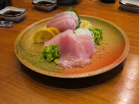
Other highlights: All the sashimi dishes were super fresh and most of the other dishes were delicious in general and so here are a few of the ones I liked the most.


Aburi Toro Steak
Tuna sashimi
Seared Tai Flower
Takoyaki

Failures
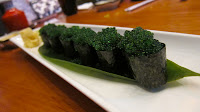
Avoid: This was the one dish that was totally unappetizing and tasted bland. The wasabi tobiko sushi needs to be taken off the menu.
Wasabi Tobiko sushi

Notes
When I go back to Sushimoto I already have a list of things I want to try that I wasn't able to hit on this trip. I'm definitely wanting to try more of the aburi sushi, fresh oysters and Oyster Motoyakis (hopefully they have oysters in stock next time), Moto Orange, and the Takowasabi.

Thursday, December 01, 2011

Analysis of Gmail's new UI

Gmail UI Analysis
This is obviously a comparison on specifically the English UI. This analysis may not be relevant compared to other languages.

Search Bar (Old vs New)
Search Bar
-removal of Search Web button
-removal of "Show search options" link
-removal of "Create a filter" link
-change icon, increase visibility with color contrast
-addition of small arrow icon in search box as 'advanced search' toggle
Result:   +  Reduced Clutter


Old Advanced Search Panel vs New Advanced Search Dialog
Advanced Search
-repositioning of fields
-compressed dialog box instead of full panel
-advanced search dropdown/filter creation
Result:   +  Minimize Space Usage

The switch to a dialog box is a good choice for an improved search interface by compacting the form and minimizing space usage. Modifying the form to a vertical form style follows a good practice (that I learned from Luke Wroblewski's book, Web Form Design) that leads to a more straightforward flow for the user to progress (from top to bottom) as opposed to the old design which had 2 vertical rows and lack of a clear path through the search form.


Old Highlighted Tabs vs New Dropdown Tab Selector
Mail/Contacts/Tasks Tab Switcher
-compression of multiple tabs into one dropdown
-displaying current section in large text button makes state of UI much more clear and more visible
Result:   +  Reduced Clutter/Better State Representation


Old "Compose mail" button vs New "COMPOSE" button
Compose(Main UI Action) Button
-text reduction
-size increase
-text capitalization
Result:   +  Increased visibility

This button style correlates to similar changes of the "Create" button in Google Docs and Google Calendar. This is definitely a plus for consistency.

Old Folders/Labels vs New Folders/Labels
Folders/Labels
-not much difference
-mainly aesthetic differences:
--highlight is now just a subtle bar indicator
--sharp corners now for label color indicator
Result:   +/-  Neutral

Chat/Calendar Toggle View Icons


Chat/Calendar Minimize Icons + Chat Resize
-Allows for more control of sidebar UI
-prevents overwhelming UI clutter
Result:   +  Cleaner UI


Old Control Bar vs New Control Bar Views

Dynamic Control Bar
-controls/actions are now more relevant to the user's accessible options
-Archive button is no longer as prominent (no bold, and reduced width)
-icons only with mouseover labels, may take getting used to
-icons aren't overtly obvious, but I guess learnable
-increased button height, easier to click
-consistent button sizes

Result
:   +  Actions are now more relevant to state of the user view 

There's still a few problems with the responsiveness of showing the right controls, but hopefully this gets fixed soon. I'd also prefer the archive button to be separate and a little more prominent. I'm also hesitant on the fully icon-based UI but I think it may be a better step to make it universal for all languages.


Notification Bar
-a little annoying with floating in between other elements/crossing lines
-different color makes the notification box more distinct from the other UI elements
Result:   +/-  Uncomfortable spacing and placement, but color change makes the notification more visible


New Display Density options
Message List - Display Density
-allows for view customizability
Result:   +  Actions are now more relevant to state of the user view


This new feature is definitely a welcome addition giving users some freedom to change the spacing on the screen. Definitely useful for certain users who may choose to view their e-mail window in a small screen, or for those who have different display sizes.


Old message list (upper) vs New message list (lower)

Message List
-removing "move" icon graphic
-shifting importance icon to left
-increased whitespace among icons
-change of checkbox icon
-change of star icon
-change of event icon
-change of file attachment icon
Result:   +  Easier to view data

The subtle icon changes are complementary to the overall change towards the minimalist aesthetic. As a designer, the shift of the importance icon to the left and placed together with the checkbox and star features as a strong move to group related indicators and allows for easier understanding. This also creates a stronger line of readability with the tags/subject titles as they are now lined up (on an invisible left align) and much more visible against the whitespace of the sender names. (Although they were lined up before, the placement of the importance indicator beside them to the left in the old interface reduces a visual edge line of where the user should start reading.)

Old Letter View vs New Letter View


Letter View
-small font changes
-color changes
-button modifications
-user icons
Result:   +  Cleaner UI

The shift towards icon-based buttons and the use of subtle placeholder text to remove action buttons reduces space usage. The addition of icons to identify the sender supports clarity of message ownership. 


Top section advertisements: Old vs New
Ads - Top
-increased whitespace
-separation between functionality and advertisement
-removal of arrows/ad surfing functionality
-increased visibility with color contrast
-declaration that it's an ad
Result:   +  Cleaner UI


The separation of the advertisement from the interface creates a more relaxed visual style without having everything crammed together. The increased color contrast makes the ad more visible, that's great for advertisers and also makes it easier for the user's eyes. The removal of the ad surfing functionality makes sense for the most part - who scrolls through the ads for fun?


Other notes
-addition of a scroll bar for the message list is great for a more consistent interface (with the similar visual style, also preventing disappearing scroll bars) and also removing the reliance on the browser for the scroll bar style


Conclusion
I initially felt like I didn't like the new interface.
But after doing an analysis and comparison of the changes, the new UI is an improvement in almost every single way. I'm going to attribute the first impression of discomfort to the sudden change. My final evaluation leads me to conclude that the modifications vastly improve Gmail's UI with minimal drawbacks.

This was only a specific analysis of Gmail's new interface, but the changes to Google's other platforms such as Google Docs, Blogger, YouTube, and Google Calendar create a unified interface style to represent Google as a brand.

Monday, November 28, 2011

21DJC Round-Up – How Has Your Experience Been?

21DJC Round-Up – How Has Your Experience Been?

  1. How has the whole 21DJC experience been for you?
  2. What have you learned throughout the 21 days?
  3. Which question(s) did you find most meaningful? And why?
  4. What is one thing you’re going to do differently after having gone through 21DJC?
The 21DJC experience has been introspective in asking meaningful questions that I haven't asked myself, or have avoided in answering. It has helped me find out more about myself by forcing me to think about and answer these questions meaningfully.

I've learned that I spend too much time thinking. The barrage of a daily question is a little much for me as I would probably have taken a few days to think over my responses to the questions. Being compelled to respond at a rapid rate pushes me to answer more instinctively though it makes me unhappy and uncomfortable with how my answer is not thoroughly constructed. I take a long time when making decisions and thinking through situations.

I think the question that gave me the most food for thought and significance was "What is the Most Painful Thing You’ve Ever Had To Experience To Date?" I usually tell people that I've had knee problems, but I've never written it all out with all the details and the timeline. I'm not sure if it's actually helped me, but it does feel good somewhat that I'm not thinking of the pain as just some vague memory.


I think after having gone through 21DJC, I definitely need to be able to express my thoughts and opinions faster without being comfortable taking a few days to think things through. It's one of my weaknesses in not being satisfied if I don't take the time to do things perfectly.

Saturday, November 26, 2011

21DJC Day 21 – What is Your Biggest Wish for the Future?

Day 21 – What is Your Biggest Wish for the Future?

The one wish I am most interested in seeing is to just be happy. To be content with the circumstances I'm in, and accept it, and be fortunate that it's my vision of joy.

Friday, November 25, 2011

21DJC Day 20 – What Limiting Beliefs Are You Holding On To?

Day 20 – What Limiting Beliefs Are You Holding On To?

I think I limit myself by believing I can predict how things will turn out before I even attempting it. I fight against the instinct everyday to just go ahead and try to break through my preconceived notions of how the world works.

Even if it doesn't look like I'm going to succeed, I have to try.

Thursday, November 24, 2011

21DJC Day 19 – What Words Best Describe You?

Day 19 – What Words Best Describe You?

The five words that I believe would best describe me:

Integrity
I'm very driven by my principles and ideals. I am unwilling to (or at least try not) cross them, because doing so would betray my own confidence. I consider it my greatest strength since most of my friends put their faith in me without worry.

Focus
I am unrelenting when I have a certain level of expectation in my work. I am willing to spend countless hours for that little bit of extra effort to near perfection on my projects and my creative endeavours. Determination is key to being satisfied with my own efforts.

Loyal
I am dependable to a fault. If someone asks for my help, I will more likely than not say yes even though it is not in my best interest.

Patience
Being calm is my way of dealing with stressful situations. I find panicking unproductive and a waste of mental resources. Even when I am faced with a circumstance where failure is guaranteed, I believe making the effort to strive when the probabilities are stacked against you is when you find your true self.

Meticulous
I am very detail-oriented. I am methodical and I approach everything in my path in a logical way. I guess it's the reason why I ended up working as a web developer.

Wednesday, November 23, 2011

21DJC Day 18 – What Matters Most To You?

Day 18 – What Matters Most To You?

Having gone through my experiences and from all the time I've spent thinking and meditating about life, the world, and just everything, what matters most to me is to be authentic. To be honest, to be someone who other people can believe in, to make a difference in other people's lives.

To paraphrase Mahatma Gandhi, I wish to be the change I wish to see in the world. I hold myself to my own standards to act better towards others as I wish others would behave towards myself. What matters is my ideals of how to treat other people and I know if I go against these ideals, I would lose respect for myself and would likely go into a downward spiral of how hypocritical I have behaved.

By following my principles and living my life adhering to them, I give myself a clear path of how to make decisions when I am given difficult choices. By doing so, I choose to free my mind from worrying about many things. I assure my mind is free (for the most part) from guilt, regret, and indecision.

As long as my principles are sound and true, then I will have no doubts that I have done the best I can.

Tuesday, November 22, 2011

21DJC Day 17 – If The World Came To An End Today, How Would You Feel?

Day 17 – If The World Came To An End Today, How Would You Feel?

I don't really like to think of what-ifs too much. Thinking about hypotheticals is something I don't typically ascribe to regarding how I feel because then it becomes a mind game about second guessing how I would act.

If the world came to an end today, then I would accept it. It is what it is. What I feel isn't going to stop the world from ending, though if it could, that would be quite interesting.

Monday, November 21, 2011

Vancouver Startup Weekend 2011 Overview

I volunteered at Vancouver Startup Weekend this past weekend and I got to meet a lot of cool people and saw a lot of great teams come up with interesting projects.

Final Presentations
This is a brief overview of the teams that presented, but you can take a look at each teams videos as posted below. The video isn't the best quality, and some are blurry, but feel free to blame my shaky hands. =)

Congratulations to all the 14 teams that survived the weekend!

Presentation 1: JukeNuke
JukeNuke@JukeNukeAppJukeNuke(fb)

Mobile phone app that let's the user have an interactive experience with the music in the venue they are in by voting up or voting down songs that are in the playlist of the bar/club that they are in.


Presentation 2: SocialQs

Algorithmic software solution that leverages social media (specifically Twitter) that uses natural language processing to extract user sentiment on products and use that data to predict stock price behaviour


Presentation 3: Distinctivo

Live stream of employee events and applying game mechanics to make work fun


Presentation 4: bagtag
bagtag, @bagtag_tweets

Integrated service to let e-commerce shoppers find out how other shoppers are combining their purchases on a particular product, ie taking a peek at other people's shopping carts who are looking at the same product as you.


Presentation 5: Let's Coffee

iPhone app to be able to meet new people in your area for coffee, and rate how good they are to meet.


Presentation 6: OrganizedGood
OrganizedGood@OrganizedGoodOrganizedGood(fb)

Online platform to allow for a dialogue on civic issues and social responsibility to be raised and trigger engagement through offline participation


Presentation 7: epibuy

Digital tablet application that streamlines the purchasing process of products you see on the television program the user is watching


Presentation 8: My Best Helper
My Best Helper

Matchmaker platform to connect people who require caregiving services such as elderly care, pet care, or child care with individuals who are able to provide needed services. E-harmony for caregivers.


Presentation 9: Pay It Forward

Reward and recognition software for companies that uses gamification elements to promote employee productivity


Presentation 10: Trust.me
Trust.me, @trustdotme

Service that leverages social networks in order to determine the reliability of buyers and sellers in online marketplaces.


Presentation 11: SocialBuzz
SocialBuzz, @SocialBuzz_, SocialBuzz(fb)

Social events data aggregator that leverages twitter data to find out what events in your area are trending or 'buzzing'


Presentation 12: SmartCity

Smartphone app that will allow users to determine the electrical usage of appliances


Presentation 13: Qutie
Qutie App@qutieappQutie(fb)

Virtual monster app on your mobile phone that eats and interacts with QR codes that you find in the real world


Presentation 14: Epic Bets
Epic Bets, @epicbets, EpicBets(fb)

Mobile phone app to allow users to bet against each other on sports events using virtual points


Top Finishers
First place: My Best Helper
Second place: bagtag
Third place: JukeNuke
Best presentation: Epic Bets
Best social cause: OrganizedGood

Honorable Mentions
SmartCity
Trust.me


Photos
You can check out photos from my Flickr account from Day 2 and Day 3 below.
Credits to Anand Suchindrum, @spokanand for taking most of these photos

Day 2
IMG_5357IMG_5356IMG_5358IMG_5359IMG_5360IMG_5361
IMG_5362IMG_5363IMG_5364IMG_5365IMG_5366IMG_5367
IMG_5368IMG_5369IMG_5370IMG_5371IMG_5372IMG_5373
IMG_5374IMG_5375IMG_5376IMG_5377IMG_5378IMG_5379

Day 3
IMG_5501IMG_2672IMG_2673IMG_2675IMG_2674IMG_2676
IMG_2677IMG_2678IMG_2679IMG_2680IMG_2681IMG_2682
IMG_2683IMG_2684IMG_2685IMG_2686IMG_2687IMG_2688
IMG_2690IMG_2689IMG_2691IMG_2692IMG_2693IMG_2694